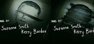
Fonts are crucial within film openings, they immediately set the tone and/or give further insight to characters and genre of the film.
 For our thriller we have considered using the font 'Break It'. We sampled the name of our production company to analyse the look of this. This font or ones similar are commonly used in British thriller films for example, The disappearance of 'Alice Creed' and 'Essex Boys'. The bold font could be used as it is confrontational forcing the viewer to read the text. Furthermore, the 'Break it' font suggests violence and anger with the font having a fractured appearance making it suitable for the subgenre it is usually used for.
In addition we have further considered using the font 'Tox Typewriter' for our credits and possibly our title. The font has a type-writer line serif font is also used in the film 'Lock, Stock and Two Smoking Barrels', the style of writing has a simplistic with a grungy effect with the displaced letters within the title. It connotes the tone of disorientation and could suggest themes of disorder which is one of the main aspects which makes a thriller.
 Furthermore, In the opening title sequence of the thriller film Se7en Script font is used, it is used to connote a character within the film before the introduction of the actor. The typeface is inconstant and jolts unsteadily conveying a nerve-racking sense of anxiety to the audience. The choice of a contrasting brightness of font brings the viewers eyes to the text however it not being centred also brings the viewer eyes to the background making the opening title sequence chaotic, foreshadowing the character of the cereal killers mind.


No comments:
Post a Comment