Showing posts with label G321 Thriller planning. Show all posts
Showing posts with label G321 Thriller planning. Show all posts
Monday, 27 February 2017

Sunday, 26 February 2017
Thursday, 23 February 2017
Sound
For our thriller opening there is no dialogue, we would like to use a small variety of sounds to create tension and tone within our piece however, we would also like to use silence to create tension within the thriller.
we have decided for our thriller that we would find specific sounds to use which may not be produced well within shooting. For example we have considered using the sound of the a door opening and closing and the crunching of footsteps on gavel.
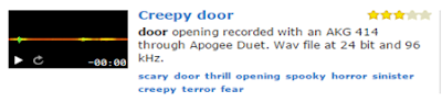
For the beginning of the thriller opening we have considered using the sound 'Creepy door' found on the website Freesound. By using this sound directly edited into our footage it allows us to create more atmosphere before anything is shown on the screen.
we have decided for our thriller that we would find specific sounds to use which may not be produced well within shooting. For example we have considered using the sound of the a door opening and closing and the crunching of footsteps on gavel.
For the beginning of the thriller opening we have considered using the sound 'Creepy door' found on the website Freesound. By using this sound directly edited into our footage it allows us to create more atmosphere before anything is shown on the screen.
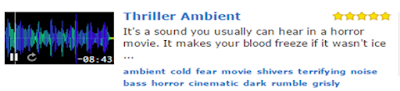
Similarly to the film Alice Creed we have though about using an ambient sound effect to run throughout the opening of our thriller to build suspense. The sound 'Thriller Ambient' creates an eerie tone, though 'The Disappearance of Alice Creed's' tone is higher pitched and tempo the effect of having an on going sound which creates suspense with the intrusion of diegetic sound creates a sense of realism though sound within it is non-diegetic which I think is very effective.
`
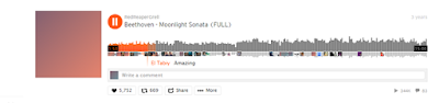
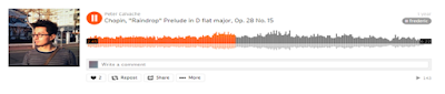
Another idea which I have experimented with is using two sounds, one playing at the same time as another, layering. Using the ambient thriller noise above and the use of a classical piece over, creates a sinister effect. I have explored pieces by both Chopin and Beethoven which fit perfectly together with the other sound as different options.
Tuesday, 21 February 2017
Fonts
Fonts are crucial within film openings, they immediately set the tone and/or give further insight to characters and genre of the film.
 For our thriller we have considered using the font 'Break It'. We sampled the name of our production company to analyse the look of this. This font or ones similar are commonly used in British thriller films for example, The disappearance of 'Alice Creed' and 'Essex Boys'. The bold font could be used as it is confrontational forcing the viewer to read the text. Furthermore, the 'Break it' font suggests violence and anger with the font having a fractured appearance making it suitable for the subgenre it is usually used for.

In addition we have further considered using the font 'Tox Typewriter' for our credits and possibly our title. The font has a type-writer line serif font is also used in the film 'Lock, Stock and Two Smoking Barrels', the style of writing has a simplistic with a grungy effect with the displaced letters within the title. It connotes the tone of disorientation and could suggest themes of disorder which is one of the main aspects which makes a thriller.


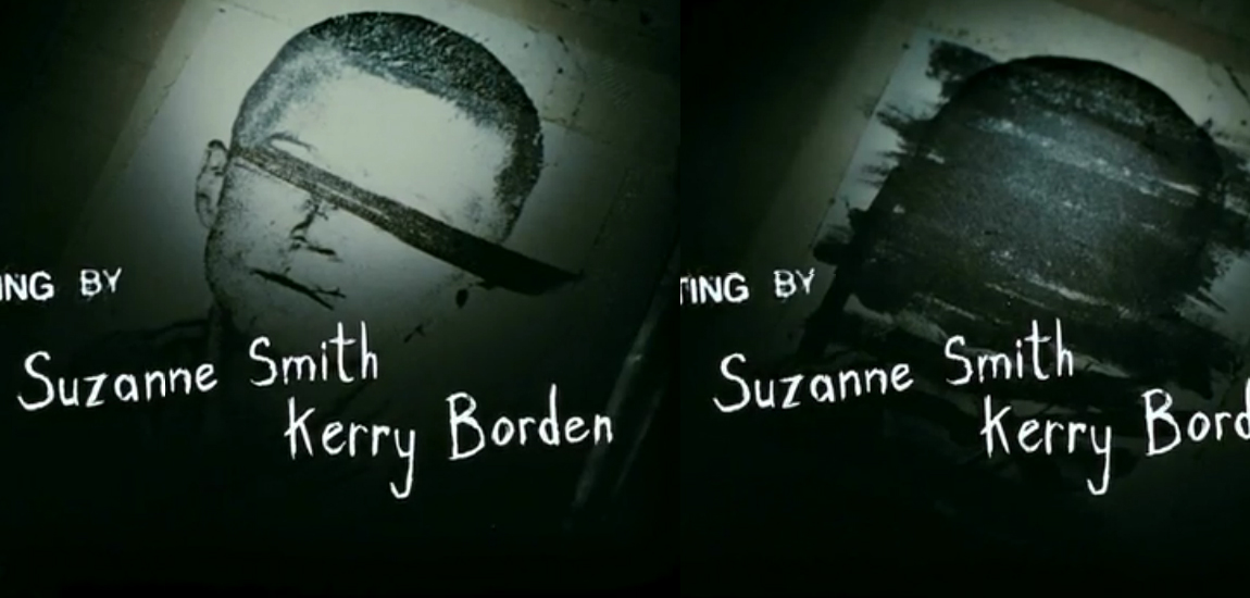 Furthermore, In the opening title sequence of the thriller film Se7en Script font is used, it is used to connote a character within the film before the introduction of the actor. The typeface is inconstant and jolts unsteadily conveying a nerve-racking sense of anxiety to the audience. The choice of a contrasting brightness of font brings the viewers eyes to the text however it not being centred also brings the viewer eyes to the background making the opening title sequence chaotic, foreshadowing the character of the cereal killers mind.
 Monday, 20 February 2017
Story Board

The introduction of characters following through to the stalking shots.

Sunday, 19 February 2017
Locations
First Location:
The first set of locations are where the protagonist and the victim live. We decided to use the location of these houses as they connote the demographic of the characters (showing large houses in a middle class area). The placement of the houses give an advantage for filming our thriller opening as the placement of the two hoses we anted to use look onto one another, this was a benefit as it allowed us to use perspective when filming our thriller opening. Furthermore, permission was easy to overcome when using the location which benefitted our group majorly. The main disadvantage we faced was the possibility of cars being parked within the space we wanted to shoot, we had no way to overcome this problem when/ if faced however to work around the obstacles.


Second Location:


Third Location
Our third location is a minor location as it's purpose is a transition location between the more significant ones before and after. For our shots within this location its purpose it to show one character following the other through what could be seen as claustrophobic enclosed spaces to create the feeling of anxiety for the character. A benefit with using this location is the possible effects that can be created with the lack of public or bust streets. If the location is quiet it create an uncanny tone in contrast however if the location where we decide to shoot is busy it creates a sense of hope for the victim with people in the way though both outcomes resulting in a kidnapping.
The idea of using enclosed streets is a common theme which is shown within thriller films for example 'The Third Man'. Though in film noir films the spaces are a lot smaller to exaggerate the sense of confusion and distress. The wider however, still enclosed streets we want to use will allow us to create suspension, as the enclosed space gradually gets smaller building to the kidnapping scene within the underpass.
The idea of using enclosed streets is a common theme which is shown within thriller films for example 'The Third Man'. Though in film noir films the spaces are a lot smaller to exaggerate the sense of confusion and distress. The wider however, still enclosed streets we want to use will allow us to create suspension, as the enclosed space gradually gets smaller building to the kidnapping scene within the underpass.


Fourth Location:
Our Final location is the capturing scene, though still similar we were initially going to film this scene in Anglia square underpass which is narrower and longer which would make would've given more of an enclosed sense. We however decided to use this location instead, it was more accessible for us to shoot in and didn't have the risk of interfering with the homeless, filming in an area where they slept. This location also had good lighting creating shadows and subtle street lighting at night, it allowed us to choose to experiment with ambient and natural lighting. The underpass also being on the edge of the city also meant that it wouldn't be as busy with public passing through whereas our third option would've been.


Similarly to underpass in the thriller series 'A Touch of Frost' the urban underpass creates a sense of claustrophobia. The image bellow from the series creates a dirty, neglect space where crime would be expected to partake in this hidden location. in 'A Touch of Frost' the attacking scene is also shown within an underpass, similarly our thriller idea where we want our kidnapping scene to happen within this location.

Thursday, 26 January 2017
Treatment
We begin with the sound of a door clicking shut, before transitioning from black to a close up shot of the antagonist’s feet walking onto his gravel driveway. The weight of his footsteps is emphasised by the diegetic sound of the crunching gravel and its grey colour palette constructs gloomy connotations. This close up conceals details of the character, making him enigmatic so creating a sense of anticipation. We cut to an extreme long shot, establishing the location of a residential street, which reveals the house opposite. A shot through an upstairs window, creating a sense of intrusion, presents the protagonist in her bedroom. Within her bedroom, we cut to a close up of her face which conveys innocence as she calmly gets ready to go out. A close up of her table as she picks up her keys presents props which convey aspects of her character; schoolbooks convey that she is young and possibly vulnerable, plus photographs of family and friends signify that she is kind and innocent. A jump cut returns us to the antagonist, a close up of his watch and the diegetic sound of ticking presenting him as impatient and creating a sense of threat as it suggests that time may be limited for our protagonist.
Influenced by ‘The Disappearance of Alice Creed’, we aim to create an increasing sense of threat in the opening of our thriller film which is also about a kidnapping. We will use a similarly bleak colour scheme, containing greys, to create connotations of misery and we will also use close ups to create a sense of intensity. Also drawing influence from 'Se7en', our film will have an urban setting, suggestive of themes of immorality and violence, as is conventional of the thriller genre. Another influence from this film is that we will use close ups of props in the home of the protagonist to help establish her character (as was done for the character of Detective Somerset in 'Se7en').
Influenced by ‘The Disappearance of Alice Creed’, we aim to create an increasing sense of threat in the opening of our thriller film which is also about a kidnapping. We will use a similarly bleak colour scheme, containing greys, to create connotations of misery and we will also use close ups to create a sense of intensity. Also drawing influence from 'Se7en', our film will have an urban setting, suggestive of themes of immorality and violence, as is conventional of the thriller genre. Another influence from this film is that we will use close ups of props in the home of the protagonist to help establish her character (as was done for the character of Detective Somerset in 'Se7en').
Wednesday, 18 January 2017
Thursday, 12 January 2017
Character & Props
Below is our brief plan for our characters including the agenda for their character, the props & costume and personality.


Within planning the characters in our group we went through changes in decision making. For the character of Lila the previous name we chose was Mia however, through decisive thought between the group we decided to change this to suit the character more accurately and give less of a similarity of name between the two characters leading the two people types astray from each other representing the deference between the characters. We decided to age the character as seventeen as it allows us as directors and students to relate to the character and present her in an accurate way. Lila is a quiet and reserved teenage girl, responsible and with a personality where she would never put herself in dangerous and vulnerable circumstances. We want to show her in her natural environment surrounded by her belongings so the audience can associate her character with her belongings (props).
Thursday, 15 December 2016
Tuesday, 20 September 2016
Subscribe to:
Posts (Atom)